september 2015

Photoshop + Clipping Masks = Greatness

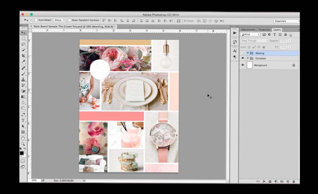
Photoshop is wonderful. Within Photoshop, the magical clipping mask tool is great. No, fantastic! It is SUPERB! I use it, like, everyday. Sure, there are layer masks and yadda yadda, but clipping masks are quicker. And easier. And awesome-er.

A clipping mask works by using at least two layers, where the bottom layer acts as the parameters for which a layer (or multiple layers) above it will show. So if you want to make some sweet pattern defined to the shape of a heart – put your pattern on top of a heart shape, make it a clipping mask, and voila! It’s SO easy.

I made a video tutorial (my first one, yikes!) of how I use it and how you can too! 


kaitlyn.jpeg

I’m Kaitlyn, your design assistant! I work with successful creative entrepreneurs to create cohesive, clean, and compelling visuals for their businesses. You can keep being the #girlboss you are (but with more time to focus on growing your empire)! Let's set up a time to chat!


So...What Does Responsive Design Even Mean? (Tips On Making Your Design More Mobile Friendly)

Responsiveness, as a general word, means the quality of reacting quickly. What responsive design means is that your website reacts and transforms based on how someone is viewing the site. Have you ever tried to go to a website on your phone that ISN’T mobile friendly? You are like endlessly pinching and trying to hit these tiny links and then drag, drag, drag to the right to read the whole paragraph… talk about annoying! One bad experience like that and you never try to go to that website again. Knowing this, it’s vital to make sure our blogs and websites are mobile-friendly and responsive, so that we don’t lose customers, clients, new-friends, or followers, right?

If you want to check your sites responsiveness through Google, click here.


HOW IT WORKS

In the very, very simple version of it… the grid system at play in a responsive website are based off of percentages rather than definitive pixels or other measurements. So my header might be 3x as large as my body copy, and in the code instead of saying “body copy 12px” and “header copy 36px”, it simply says, “hey whatever size that body copy is, make the header 3x as large.”


SQUARESPACE BUILT IN RESPONSIVENESS

This is part of the reason I LOVE SQUARESPACE, y’all. It’s automatic. It’s responsive without you having to lift a finger. That’s awesome. When you are designing a Squarespace site, you can pull down the top bar (it’s gray, there’s an arrow when you hover) and click to see what your website looks like via phone or tablet, as well as the desktop version. This is really important! Over 40% of my views come from mobile, so that’s 40% of people that I want to make sure can have an enjoyable experience! So throughout editing and designing I am constantly double checking through those icons and making sure things are easy to read and understand and navigate via mobile.


BEYOND JUST RESPONSIVE

So you have a responsive site, but that’s not all you should consider. The other really big, and often overlooked, thing is that HOW you use your mobile device is different than how you use your computer.

I don’t know about you, but if I am trying to go to a site and everything is taking kajillion years to load from my phone, I’m already over it and onto Instagram or the next thing. Call me a millennial, but my mind is about 100 places at once and it’s not waiting for pages to load. I’m going to go with the big assumption that most people feel this way, too. Plus, we aren’t always on free wi-fi so I don’t really want to destroy my data plan waiting for your 300dpi 18x24in photo to load.

For photos you should aim for images below 500KB in size and less than 1500px wide. So, tune down to 72dpi, because 300 doesn't matter in web. If you need a tutorial, I can help you out with that (just let me know)! Other things to consider: If you are blogging, try using excerpts and “read more” links, rather than your whole 1000 word entry. Also, check letter spacing (less than 0px usually looks terrible/illegible on mobile).


What other questions do you have about responsiveness? I’d be glad to help you out! Please let me know in the comments below! Hope everyone is having a great start of the week!


kaitlyn.jpeg

I’m Kaitlyn, your design assistant! I work with successful creative entrepreneurs to create cohesive, clean, and compelling visuals for their businesses. You can keep being the #girlboss you are (but with more time to focus on growing your empire)! Let's set up a time to chat!